Website design inspiration gets repetitive when every example is a spacious portfolio with the same giant type and smooth scroll. A memorable site does not need to be fashionable. It needs a point of view that survives the first screenshot.
These websites use very different methods. Some are technically polished. Some are old, dense, or proudly awkward. Each makes a decision strong enough to learn from.
1. Cameron's World
Cameron's World rebuilds the atmosphere of GeoCities from graphics and text rescued from archived personal pages. The collage is loud, layered, animated, and far more coherent than it first appears.
It shows how curation can turn discarded web fragments into a new work without sanding away their original character.

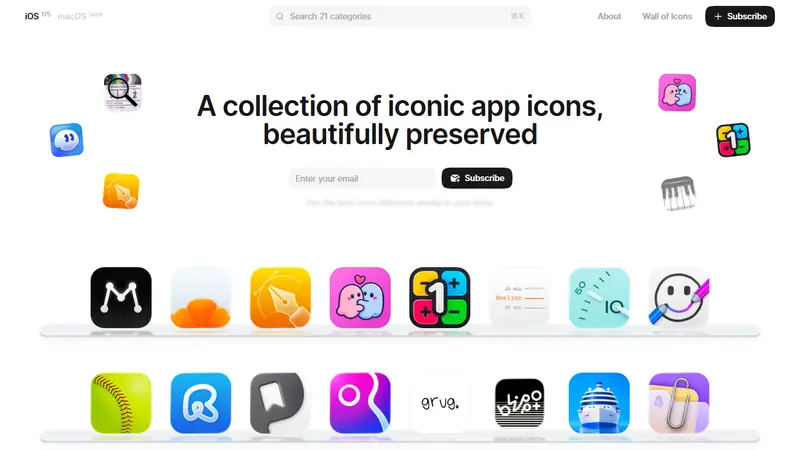
2. Icon Museum
Icon Museum presents notable app icons in a clean searchable gallery. The interface stays quiet so details in the artwork can carry the page.
It is useful inspiration for product designers, but the larger lesson is restraint. A collection works when the container knows when to disappear.
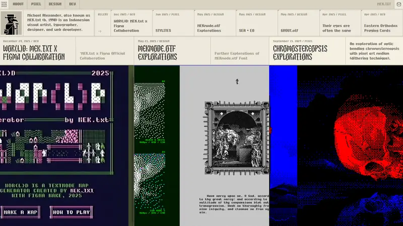
3. MEK.txt
MEK.txt is Michael Alexander's online portfolio for pixel art, typography, graphic design, and development. The visual language belongs to the work instead of sitting around it like a neutral frame.
That makes the portfolio feel authored before you open an individual project.
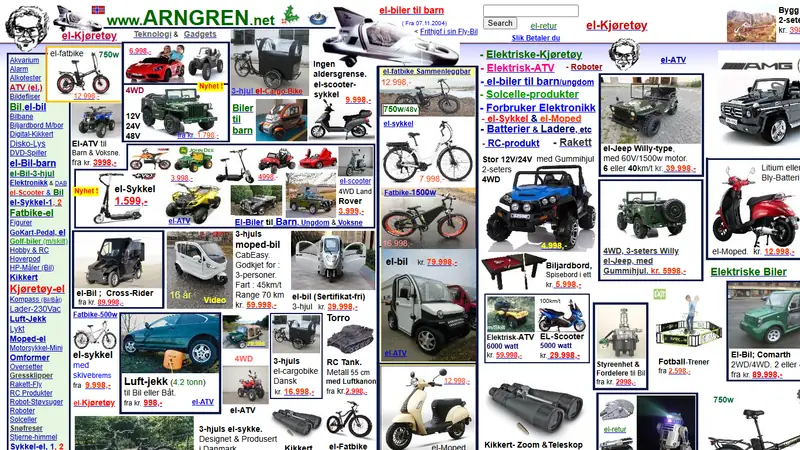
4. ARNGREN.net
ARNGREN.net is a Norwegian sales site filled edge to edge with vehicles, gadgets, prices, links, and contact information. It breaks nearly every modern rule about hierarchy and breathing room.
Copying it would be a bad idea for most shops. Studying it is worthwhile because density is also a design decision, and this page commits completely.
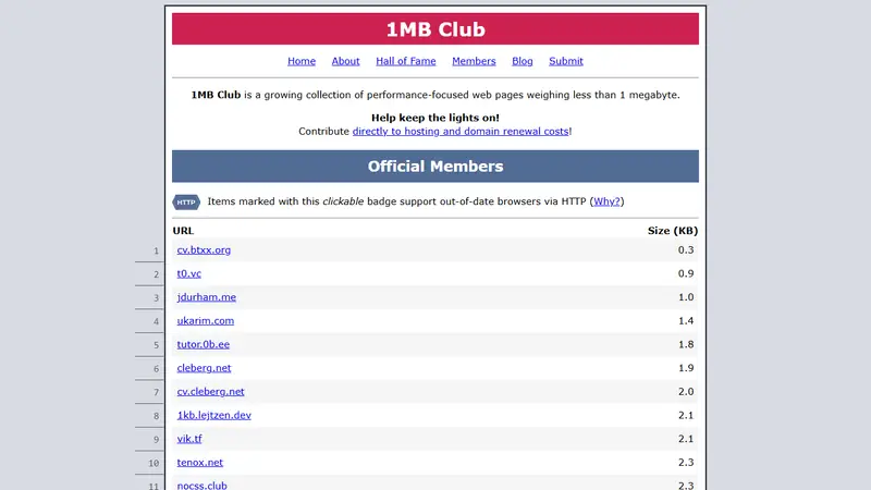
5. 1MB Club
1MB Club collects websites whose pages weigh less than one megabyte. The directory turns performance into a visible design constraint rather than a score hidden in developer tools.
Browse several entries and notice how much expression survives when a page cannot lean on heavy video or giant image bundles.
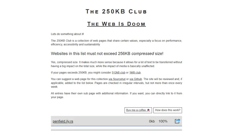
6. 250KB Club
250KB Club makes the limit even tighter. Members fit below 256KB compressed, which rewards careful typography, small assets, and direct structure.
The sites do not all look minimal. That is the useful part. A small page can still be colorful, specific, and strange.
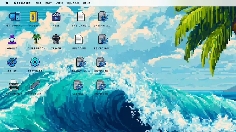
7. Chus Margallo
Chus Margallo's portfolio mixes pixel art, retro interface references, and interactive details. The presentation shows technical skill without turning into a generic case-study grid.
It is a strong example of matching a portfolio's interface to the kind of work inside it.
8. Bruno Simon
Bruno Simon's portfolio is a small three-dimensional driving world. You steer a car through projects rather than scrolling past thumbnails.
The interaction is playful, but it also gives visitors a clear memory of the creator's specialty before they read a biography.

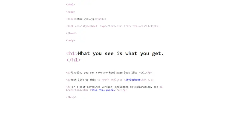
9. html wysiwyg
html wysiwyg is a CSS joke that makes a webpage display as though the HTML source itself were the interface. Tags, attributes, and content become visible together.
It is not a portfolio template. It is a compact demonstration of what can happen when the implementation becomes the visual concept.
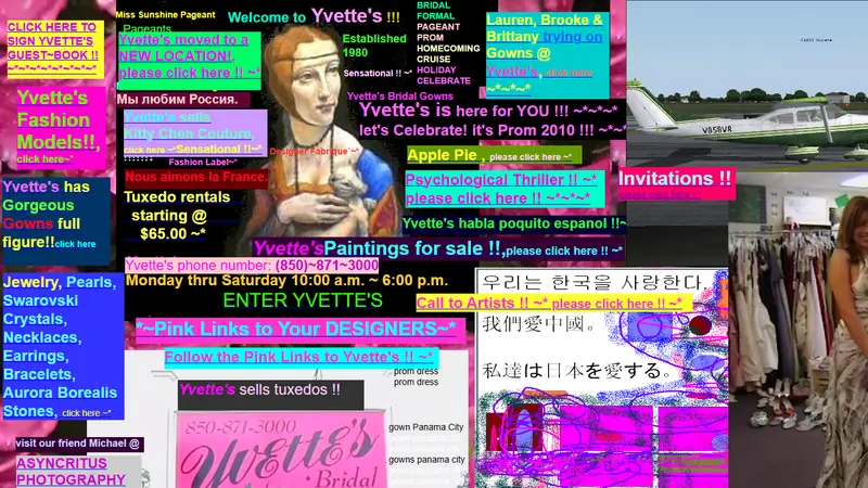
10. Yvette's Bridal Formal
Yvette's Bridal Formal is an archived business site packed with links, images, and navigation choices from another web era. There is little empty space and no fear of ornament.
Its value as inspiration is not nostalgia alone. The page communicates enthusiasm and local specificity that many polished templates erase.
Find your own references
The personal websites guide has more pages shaped by their owners. Browse old and retro websites when you want references from outside the current design cycle.