Some subjects become harder when they are reduced to a wall of explanation. A map, model, comparison, or interactive control can expose the structure much faster. The best visual websites let you inspect the evidence instead of asking you to accept a neat summary.
These ten sites organize complicated information well. They will not make every topic simple, but they give you a useful place to begin.
1. Historical Tech Tree
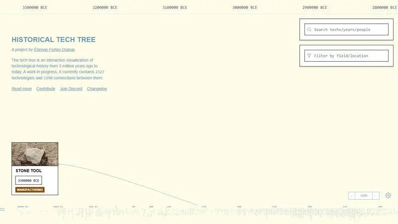
Historical Tech Tree maps technologies and the dependencies between them across human history. Follow a branch to see which materials, tools, and discoveries had to exist before a later invention became possible.
It replaces the usual parade of dates with a network, which is closer to how technological change actually develops.
2. How Much Tax
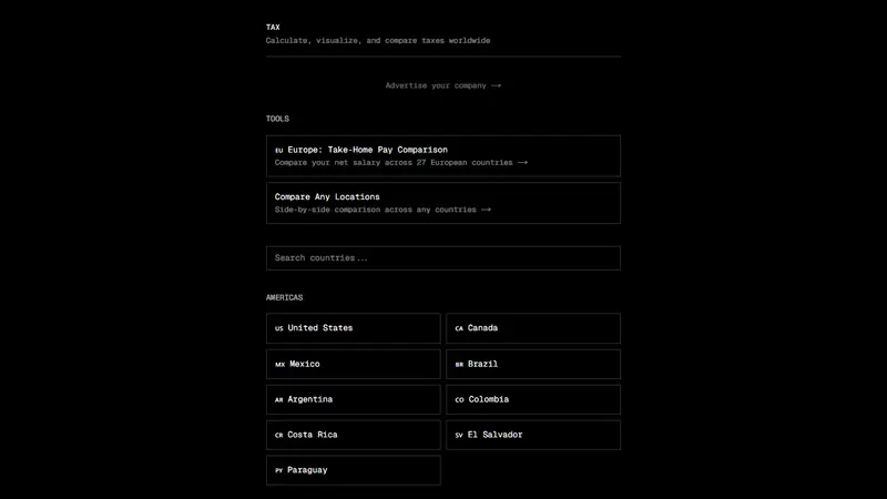
How Much Tax estimates take-home pay and employment costs across countries and regions. Comparisons help show why the same gross salary can produce very different results in different systems.
Tax rules change and personal circumstances matter, so use it as an estimator rather than financial advice. It is especially useful for getting the scale of a difference before doing formal calculations.
3. Terms of Service; Didn't Read
Terms of Service; Didn't Read summarizes and grades the policies of popular online services. Instead of pretending everyone will read a long legal document, it pulls notable terms into clearer points and links back to the source.
The grades are a starting point. Open the details when a service matters to you.

4. Is AI Profitable Yet?
Is AI Profitable Yet? compares reported spending and revenue around frontier AI companies. The page reduces a noisy business question to a few large numbers and a deliberately loud answer.
The exact accounting debate is more complicated than a tracker can settle, but the site makes the scale of spending hard to ignore.

5. Ptable
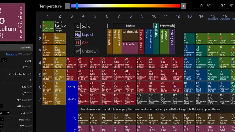
Ptable is an interactive periodic table with element properties, isotopes, trends, electron information, and chemistry data. Select a category and the whole table changes to show the pattern.
That makes relationships easier to see than they are in a list of isolated element facts.
6. Scale of the Universe
Scale of the Universe places objects from subatomic particles to the observable universe on one continuous zoom. You can stop at any point and compare nearby scales.
It is a strong antidote to numbers so large or small that they stop meaning anything.

7. Earth Wind Map
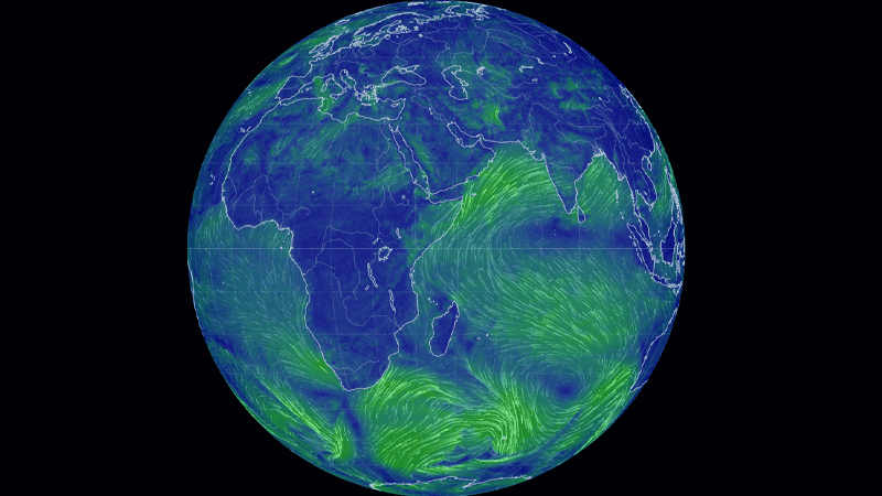
Earth Wind Map draws weather and atmospheric data over a rotating globe. The moving lines reveal large systems that are difficult to recognize from a table of local forecasts.
Switch layers carefully and the site becomes both a current view and a lesson in planetary circulation.
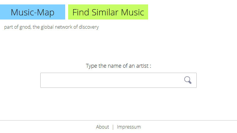
8. Music-Map
Enter an artist and Music-Map arranges related musicians by similarity. Nearby names are closer in style, giving you a visual route through genres and scenes.
It is not a definitive map of taste, but it explains its recommendation space better than an unexplained autoplay queue.
9. There's Nothing to Watch
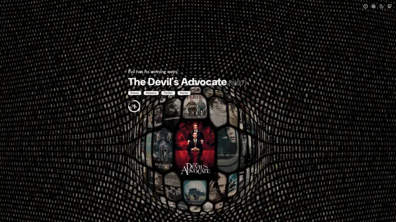
There's Nothing to Watch arranges tens of thousands of films in an interactive map. Nearby movies share relationships, so moving through the field can be more productive than scrolling another flat list of thumbnails.
Use a film you know as an anchor, then inspect the neighborhood around it.
10. What Are The Odds?
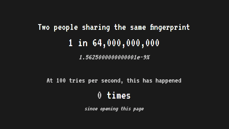
What Are The Odds? moves through events with smaller and smaller probabilities. The sequence gives context to numbers that otherwise look like interchangeable strings of zeroes.
You may not remember each figure, but you will leave with a better feel for the distance between unlikely and nearly impossible.
Find another useful explainer
Browse useful websites for calculators, references, and practical tools. Our interactive science websites focus on models you can change yourself.